Boya
Latumahina is a Dutch London-based Art Director who created our incredible logo.
She studied at the Central Saint Martins College of Art & Design in the
British capital and lives there with her partner and young son. She currently
leads the creative department of a luxury hospitality group, where she conceptualises
ideas and oversees the production for social media, print and events for clubs
and restaurants such as The Ivy, Annabel’s and Sexy Fish.
She was excited when her friend Nataly Sopacuaperu told her about Bahasa Basudara as she too wanted
to be part of a wider
international Moluccan community. And was disappointed when she couldn't join the tutoring programme, due to a hectic work schedule and other commitments.
She was however thrilled when Jeff Malaihollo approached her to ask if she
could design the Bahasa Basudara logo.
Here she
tells us how she found her inspiration.
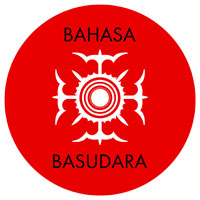
“The logo
came about by digging into our ancient ancestral Alifuru history. I researched
the language, our symbols and colours but also looked at what we stand for and
what we want to achieve with Bahasa Basudara.
For the
logo I chose to adapt the symbol that represents Siwalima. The word Siwalima
is formed from two words taken from the history of the kingdoms that once
existed in Maluku. The word Siwa means Nine, signifying the
collection of nine kingdoms in the southern Maluku. The word Lima, which
means Five is taken from Patalima, a collection of five kingdoms
in northern Maluku.
The big
circle represents Mount Nunusaku in Seram, which we believe to be the
origin of all humanity. The 4 birds in the symbol represent the migration of
humanity from Mount Nunusaku to all four corners of the world. This symbol is
very much about our heritage and our place in the world.
I went for
traditional Moluccan colours: Red which represents courage and
confidence; White which represents purity and symbolises Kain Gandong
(the cloth that unites us all) and of course the colour Black, a
traditional colour that is still used in our Adat clothing, along with red.
For our
certificates I’ve chosen to adapt traditional Moluccan patterns. The achievements
are framed by these inherently powerful illustrations, to communicate a sense
of identity, culture and pride.”


11_105_90.jpg)


_105_90.png)